A roundup of colour trends for 2022
A roundup of colour trends for 2022
The start of a new year may be all about resetting our personal intentions, but it’s also the perfect time to refresh our living spaces and embrace the very latest colour trends. We’re tapping in to the top picks of some of the most renowned colour authorities to see what shades they’ve chosen as the standouts in 2022. And while opinions may vary, one thing’s for certain – we’re gravitating toward everything from earthy, soothing, neutral tones to ground us in the midst of pandemic mode, to cheerful, optimistic colours that signal a brighter outlook ahead.
Gorgeous greens
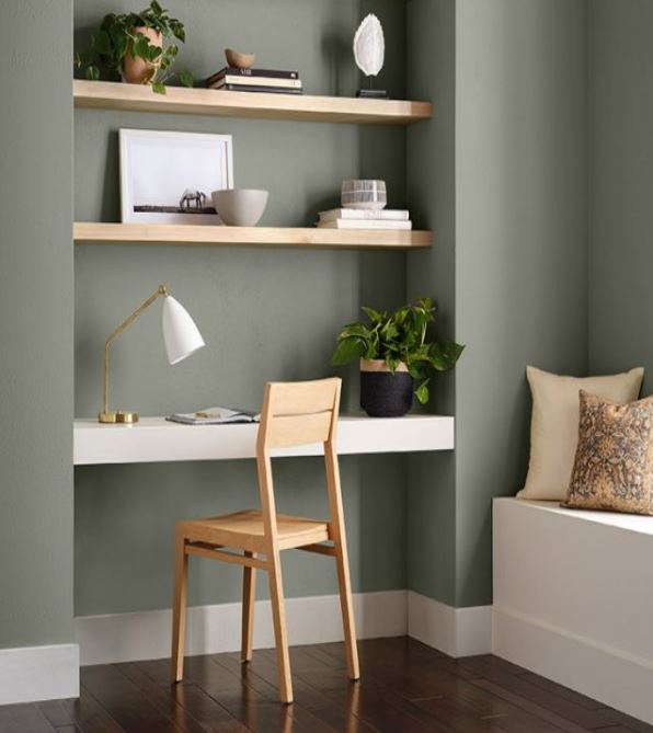
Sherwin-Williams, Evergreen Fog
Many of the leading paint and colour experts agree that the best energy this year is coming from stunning shades of green. At once cozy and invigorating, green helps restore a sense of calm and brings the healing, rejuvenating power of nature into our homes – particularly as health and wellness continues to be a focus. Here are a few of the star greens chosen for 2022:
• Benjamin Moore October Mist – gently shaded sage that quietly anchors a space while encouraging creativity. See the entire Benjamin Moore Colour Trends 2022 Palette for tons of earthy inspiration
• Farrow & Ball Breakfast Room Green – this pretty shade remains lively in both bright sunlight and soft candlelight
• Sherwin-Williams Evergreen Fog – a chameleon colour of green-grey with a hint of blue
• Dulux Olive Sprig – a mid-tone lush green with an organic undertone symbolizing regrowth and resiliency
• Behr Breezeway – a silvery green shade with cool undertones
From subtle sage to dramatic emerald green, even the colour-averse can agree that these natural hues would be perfect in any room.
Hopeful blues
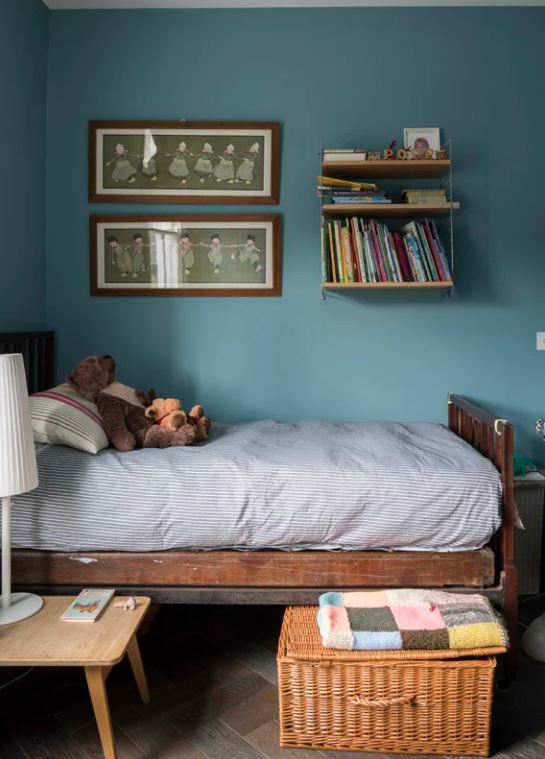
Farrow & Ball, Stone Blue
Oh blue, how we love thee! A perennial favourite and forever a go-to, the right shade of blue in your home can be uplifting and day-dreamy, calming and optimistic. We love the current hues that are making designers swoon:
• Benjamin Moore Philipsburg Blue is a grey-blue that is at home in both traditional and contemporary spaces
• Farrow & Ball Stone Blue has a vintage tone that’s warm and timeless, and invites long visits with family and friends. Paint an interior door this friendly and universal colour or an entire room, ceiling to trim.
• Dulux Bright Skies is a calming shade that brings a breath of fresh air into your home. It inspires with the thought of endless skies and faces turned toward the sun, and offers a sense of well-being and optimism that is more than welcome right now. Try it on the ceiling in your bedroom or powder room.
Pretty peri
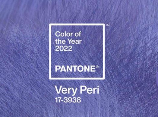
Pantone 2022, Very Peri
Just slightly left of the popular blues, Pantone threw everyone a curveball with its choice of Very Peri – an entirely new hue created for 2022. This vibrant shade of periwinkle was designed to pique curiosity and creativity, with a joyful, warm undertone meant to symbolize our transition out of pandemic isolation.
Super fun in kids’ spaces matched with brights like yellow and pink, Very Peri also pairs unexpectedly with all the grey-greens and even terra-cotta for a more mature, nature-inspired feel. And if you’re not quite ready to commit to paint, Better Homes & Gardens has a list of accessories to dot your décor with just the right amount of this playful colour.
Warm neutrals
Farrow & Ball, Schoolhouse White
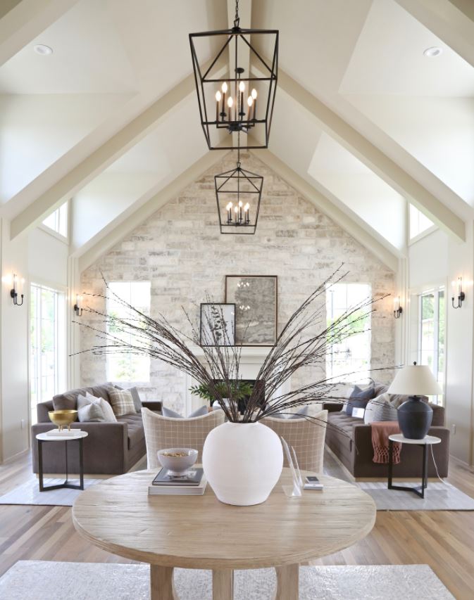
There will always be room for warm neutrals that bring the cozy. With their approachability and versatility, they happily lay low while providing the perfect backdrop to a variety of décor styles and colours. The fascinating thing about neutrals is their ability to change in different light. In bright daylight they can feel crisp and clean, and as the sun sets they shade-shift to warmer hues just right for nesting.
One of our favourites is Farrow & Ball’s School House White, designed to look like white in a shaded area, with its muted, timeless colour that feels nostalgic and familiar. This is contemporary neutral at its finest. Benjamin Moore’s White Dove is also great option for a creamy, welcoming white.
For options that bring a bit of colour, check out Veranda’s gallery of warm neutrals you simply can’t go wrong with. And think bouclé and chunky knits for of-the-moment décor.
Sunny citrus
Farrow & Ball, Babouche
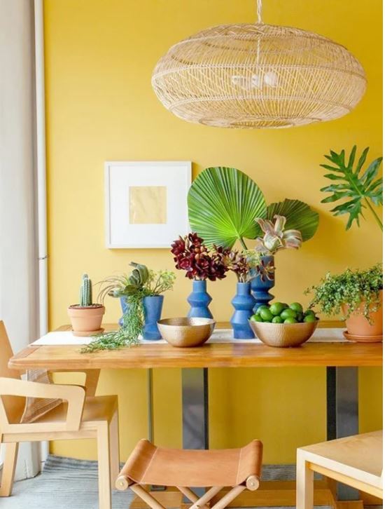
Cheerful, buttery yellows help to brighten a space – and a mood – with its bold but not overbearing presence. Farrow & Ball nailed it with Babouche, perfectly described as “subdued sunshine”. Pair it with a soft black like Railings for a modern look, or accessorize your space with some of these suggestions from Country Living.
Moody hues
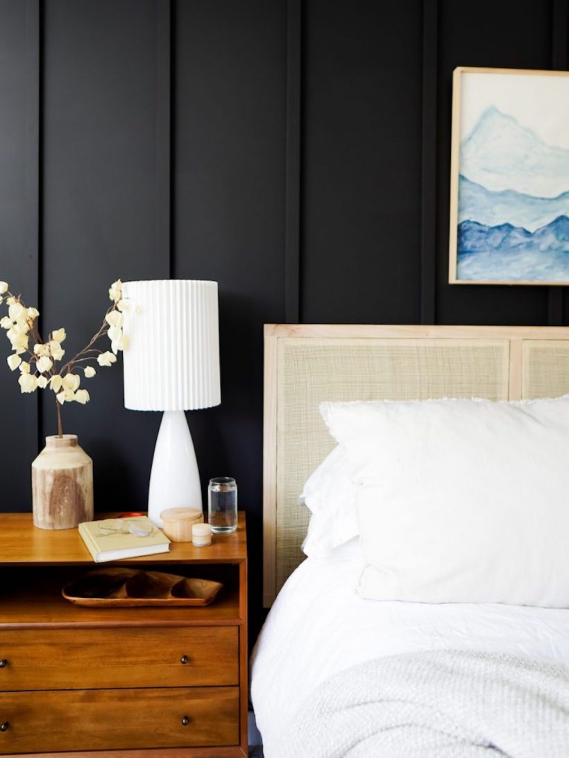
Image courtesy of Pinterest
A big trend in 2021 that’s spilling over to the current year is monochromatic darker, complex hues like deep aubergine, rich charcoal, rusty terra cotta and inky blue that add a ton of drama. Not just reserved for walls, consider painting out baseboards, trim and even the ceiling for a fully enveloped space that brings an instantly chill vibe. Add stone pots filled with twigs and other nature-inspired accessories for a minimalist aesthetic that stands the test of time. These hues are your new black.
Interior design bloggers Chris loves Julia does this best and have taken cues for their own home from the palette at the Met.
Goodbye greys
After a decades long run, we’re finally ready to move away from monotonous neutrals like grey and stark white. Colours with a cool undertone are on the outskirts right now as we welcome in warmed-up neutrals and anything that brings the outside in.
Whether you’re giving your great room a refresh, updating a kids’ space or finishing your basement, anything goes in 2022. Colour trends are a great guideline to steer you in the direction of what’s current, but keep in mind that trends come and go – and the best judge of what’s right in your home will always be you.

